November 12, 2015
I am proud to announce that I have been rated the #1 digital graphic designer in San Francisco by Thumbtack! Here's a link to the page: https://www.thumbtack.com/ca/san-francisco/digital-graphic-designers/
July 14, 2015
I recently completed this logo for Lockwood, a new brand of mobile device cases, covers and sleeves. The target audience is men and women ages 25-45 who are professionals that lead mobile lifestyles. Within just weeks of Lockwood's first iPhone case release, it is averaging 5 stars on Amazon! (no doubt in part because of the logo ;)) To view more of the work, please go to Lockwood's page in my portfolio. To learn more about Lockwood, go to www.lockwoodco.com.
October 29, 2014
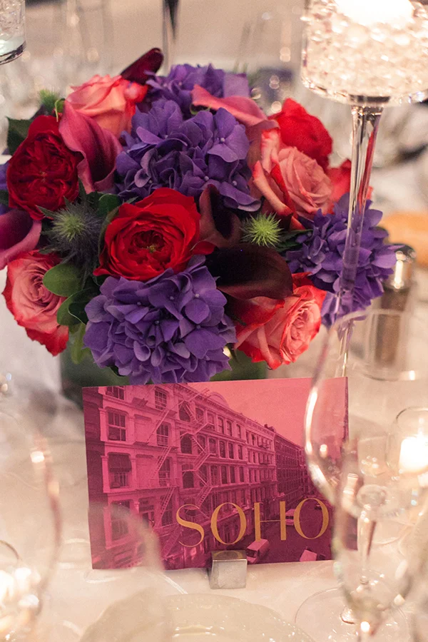
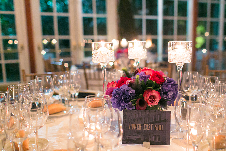
I got married on October 19th in New York City. I designed the menu, table cards, and welcome letter at a HIGHLY discounted rate. ;)
Instead of numbers, we gave each table the name of a different NYC neighborhood, and I tried to choose a typeface, image and duotone which captured the feeling of the neighborhoods and worked with the color palette of the wedding. Here are several of my faves:
October 25, 2014
I recently completed this logo and mark for Les Méchantes, a woman's lifestyle clothing brand in San Francisco. To learn more about the project go to bfcreative.net/#/les-mechantes/. To check out the Les Méchantes brand, go to lesmechantes.com.
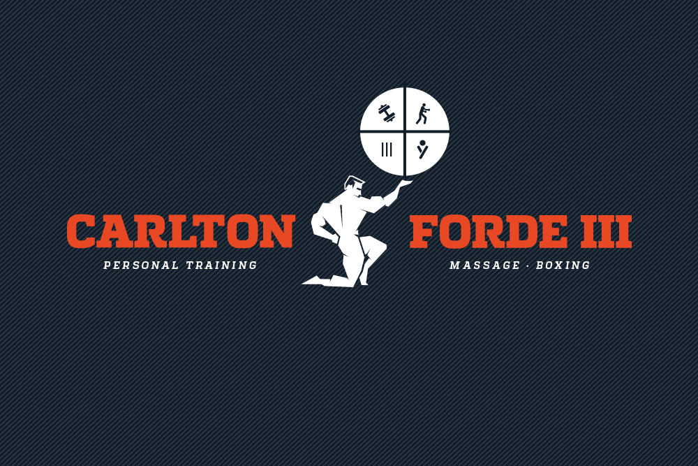
Carlton Forde III is a fantastic personal trainer in New York City. His identity project is great example of how designers need to stay open (I said open, not give in no matter what :)) to the client’s ideas. After presenting Carlton three logo concepts, he asked me to combine the type from one with the imagery from another. I’ll admit that I was skeptical at first, but it ended up working. To see and read about more of the work, check out Carlton's page in my portfolio.
FINAL LOGO
When LA-based interior design firm DTLA got the chance to offer residents of Downtown LA’s hip and luxurious Met Lofts a complimentary consultation, they turned to me to design a postcard for them. The clean and modern design helped to communicate the DTLA aesthetic as well as appeal to the residents of Met Lofts, an apartment complex with a similar look and feel. I was proud of the pop of yellow as a second color, and the use of the modern furniture icon to separate the type on the back. To learn more about DTLA, go to www.dtladesign.com.
FRONT
BACK
Below is a Point of Sale display mockup I recently designed for JUST, an exciting organization that is changing the fashion industry (and world) for the better. They were giving a presentation in a competition to win $50,000 in funding, and wanted a bold concept that would capture the customer's attention immediately.
JUST provides fashion designers with a database of suppliers and manufacturers of fabric and clothing that treat workers fairly, have a commitment to environmental and social sustainability, and do not use harmful chemicals in the finishing process. JUST is also partnering with designers to attach a JUST hang tag to their garments, that include a QR code for consumers to learn each item's story, from where the cotton was made, all the way to the finishing process, so they can have confidence that the clothing was made ethically each step along the way.
To learn more about JUST and the amazing work they're doing, go to http://projectjust.com.


