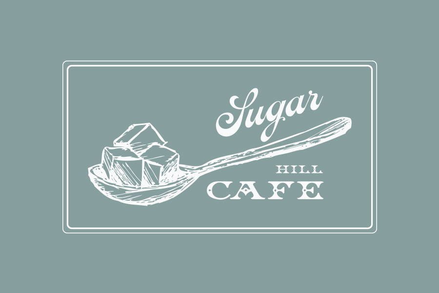
For this brand identity for a new coffee house in the Sugar Hill area of Harlem, I used Victorian era inspired imagery and type to communicate the charm of the district’s Victorian architecture.


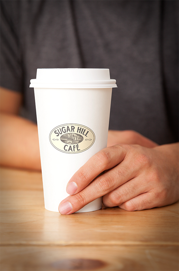

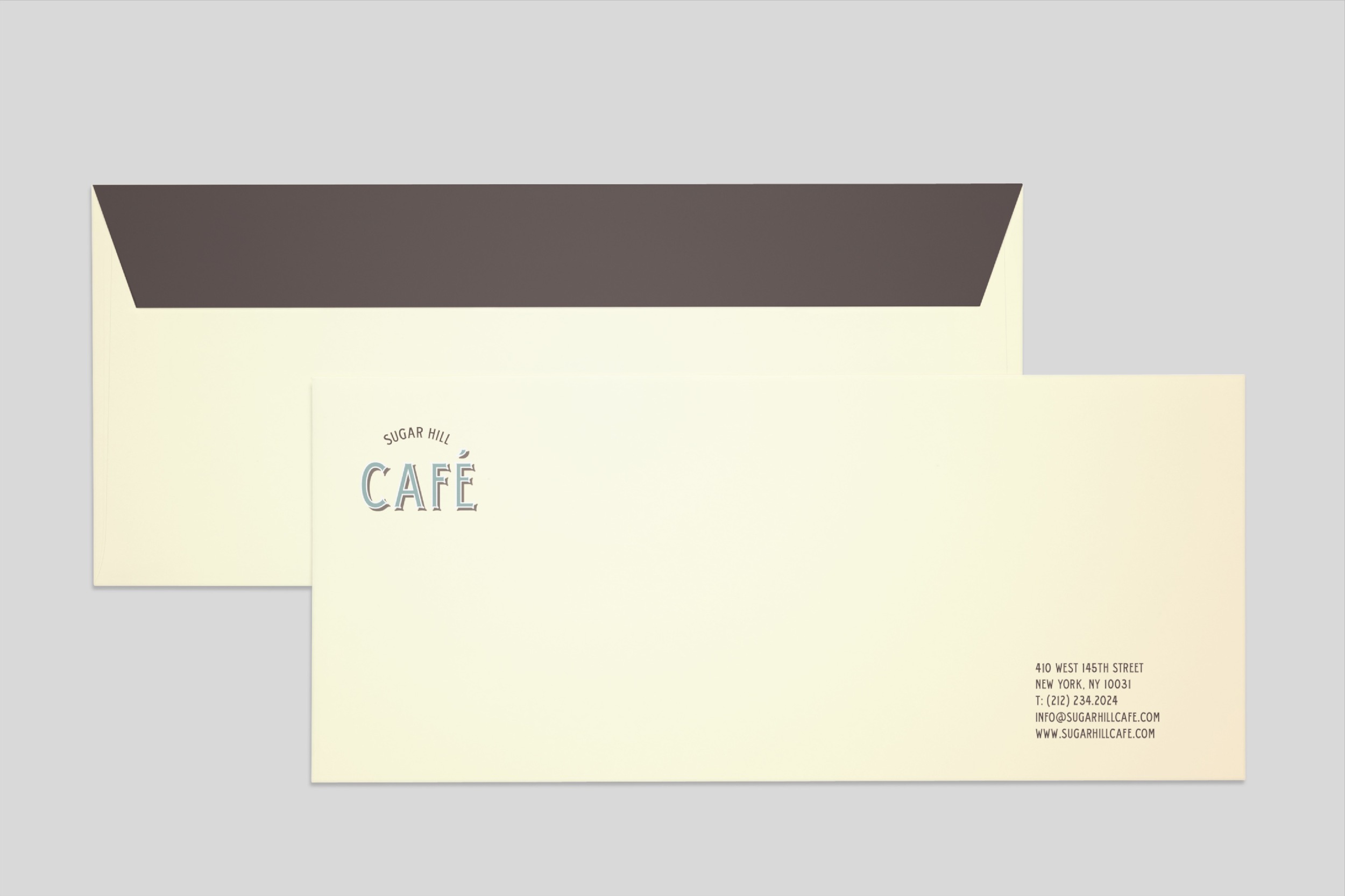
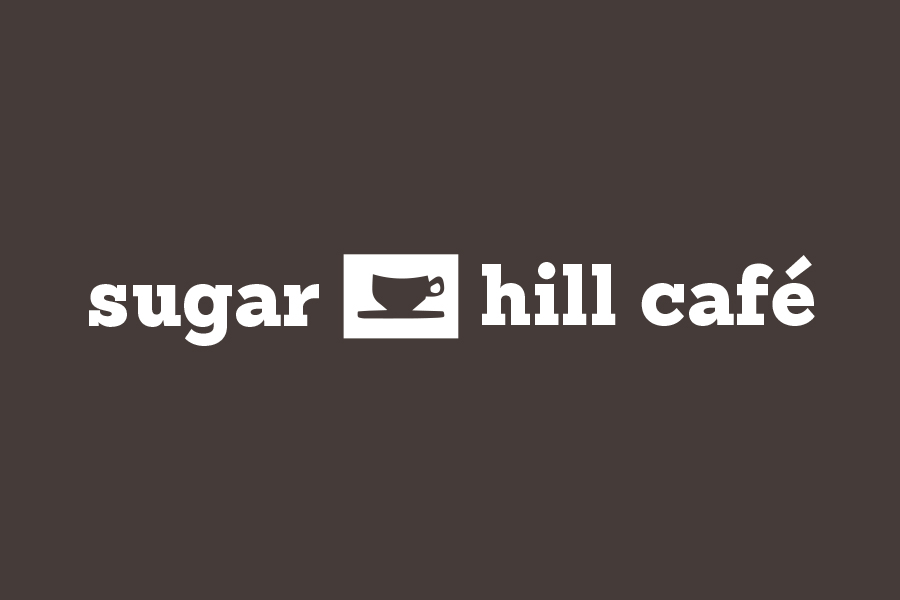
An alternate, solely typographic version of the logo was created for the stationary to make the brand identity more dynamic. Old photography of the Sugar Hill area was used on the back of the business card to further enhance the feeling of the neighborhood in the identity.

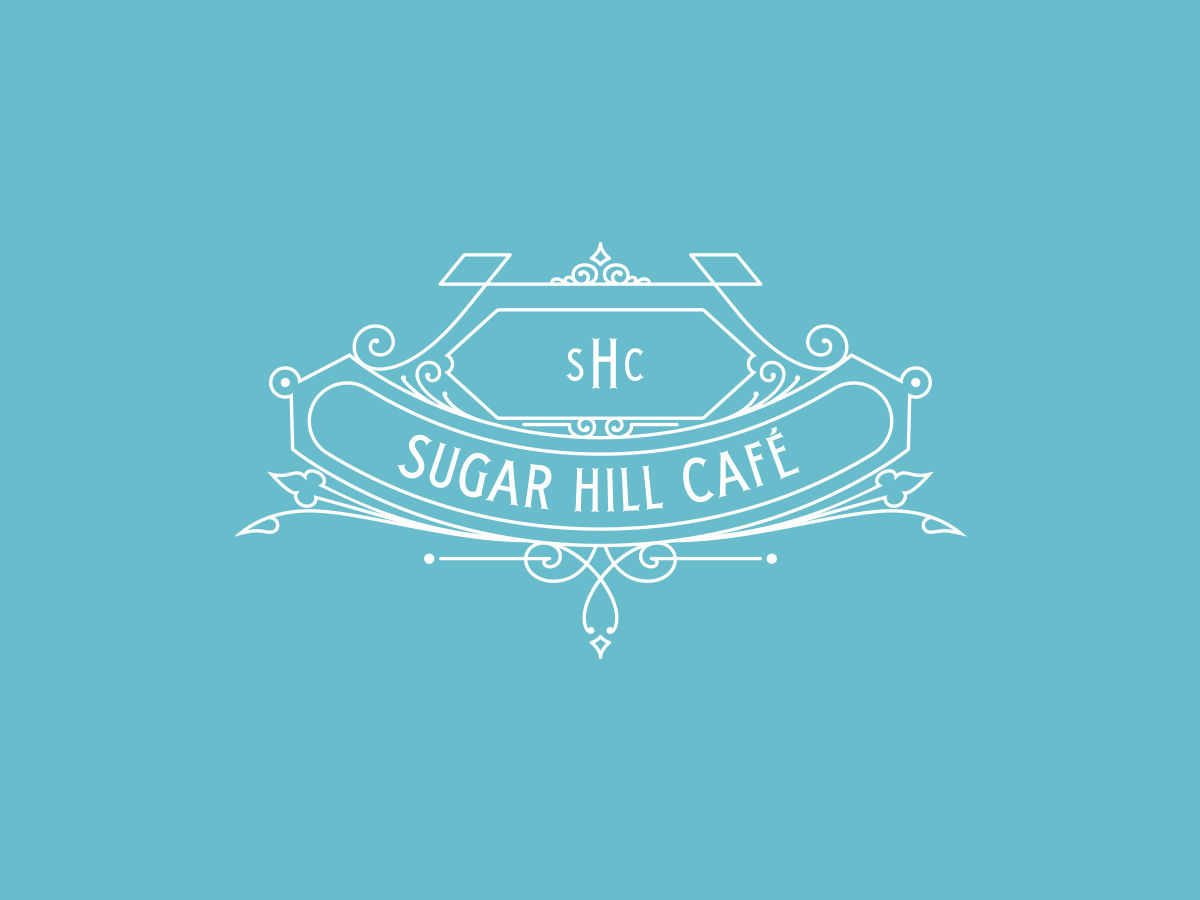
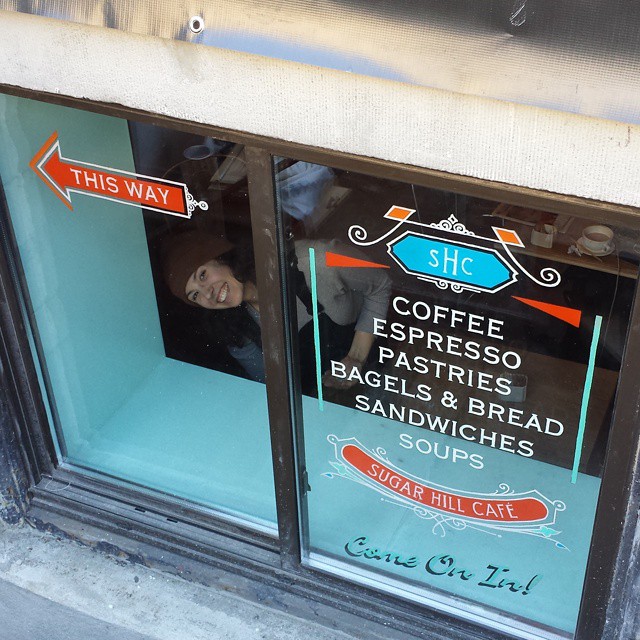
I designed this ornament for the café's identity not entirely sure what its purpose would be. After modifying it slightly, the client liked it so much he decided to use it on a variety of mediums, such as signage, windows, and menu.


Monogram Options:


Other logo versions:
A more modern direction for the logo.
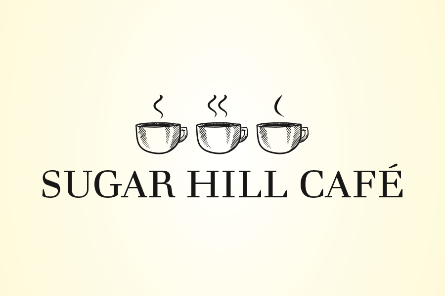
Don't miss the steam coming out of the mugs spelling SHC!