It was an amazing experience collaborating with Chicago's Juice Rx to craft their new brand identity, which has included a new logo, packaging, signage, menus, and even a tricycle!
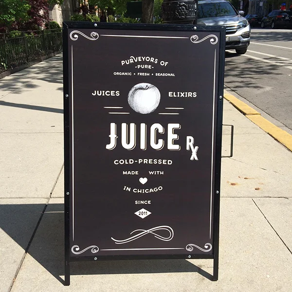
It all started with creating with this expanded version of the logo, which was turned into an A-Frame sign.

After finding out that Juice Rx wanted to apply these simple labels to their snacks in clear pouches, I realized the expanded logo could serve as a template, substituting the product name for the “Since 2011” and ornament at the bottom.


Similarly, I realized that the expanded logo could also inspire the elixir labels.


The full size juice, nut milk, and smoothie bottles and labels were the centerpiece of the rebrand.


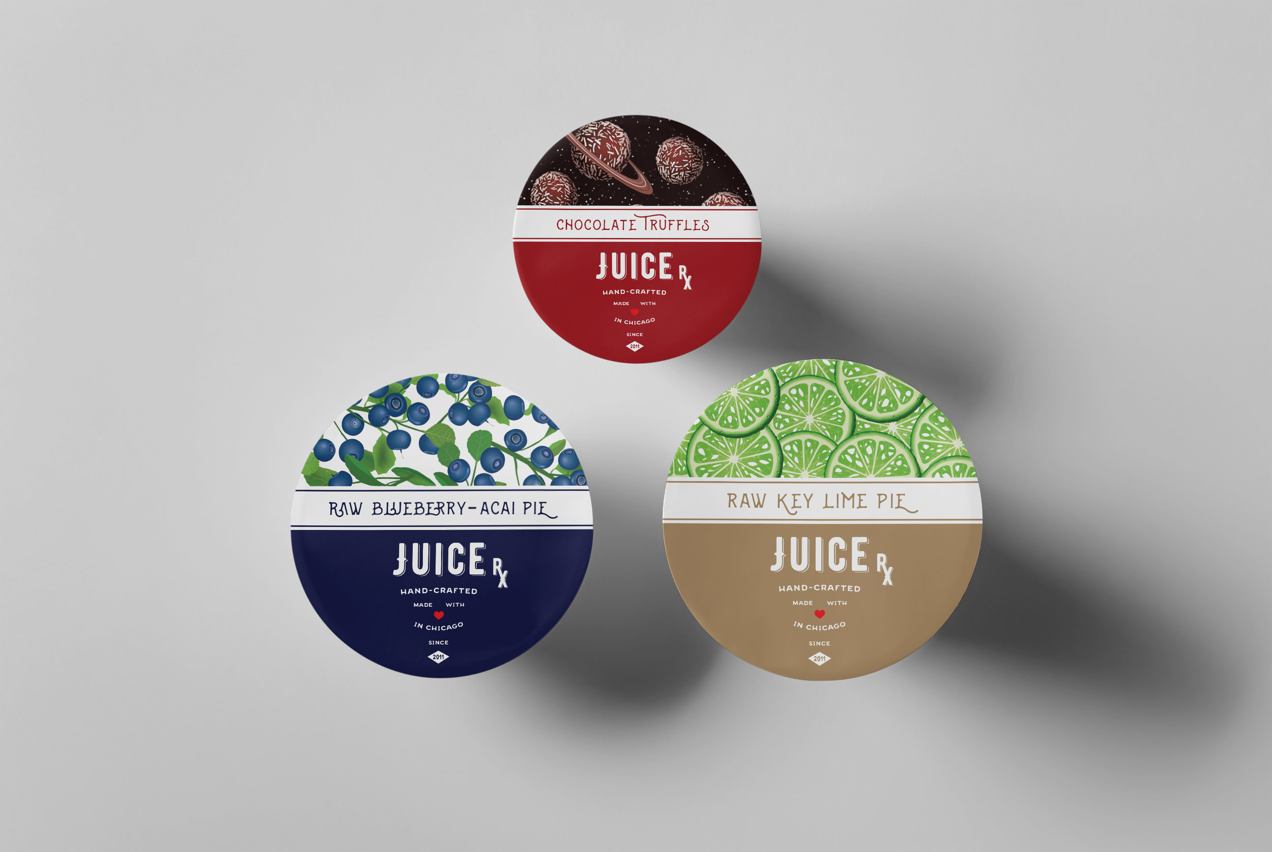
Concepts for the Juice Rx dessert container labels.


I designed the window graphics for Juice Rx's stores in Chicago's Old Town and Bucktown.

I coined the tagline “Drink Chicago’s Best”, and created this lockup, which Juice Rx has used on signage, cups, and shopping bags.
