Carlton Forde III is a fantastic personal trainer in New York City. His identity is a great example of how designers need to stay open to the client’s ideas. After presenting Carlton the original three logo versions below, he asked me to combine the type from Version 1 and the Atlas illustration and shield from Version 3. I’ll admit that I was skeptical at first, but it ended up working.

FINAL LOGO
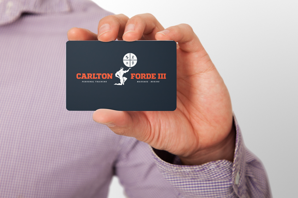
FINAL BUSINESS CARD FRONT
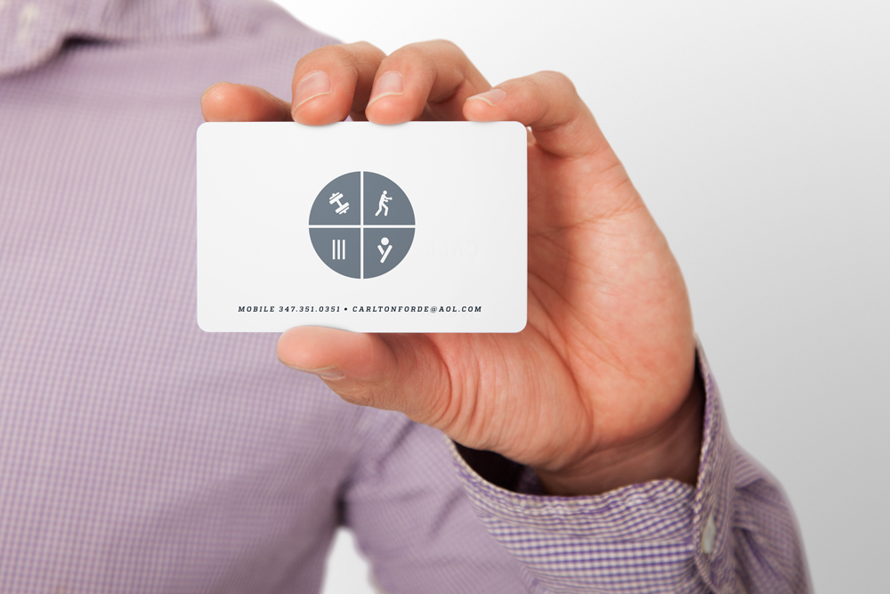
FINAL BUSINESS CARD BACK
ORIGINAL LOGO VERSIONS:

Logo Version 1. This version was very centered around the typographic lockup. I felt that bold slab serif combined with the thin serif worked together to create a composition that communicated strength, masculinity and elegance. The bodybuilder icon also helped to convey a sense of power.
Logo Version 2. This concept was based on three things Carlton told me about himself: 1.) He admired the Greek mythological figure Atlas 2.) He had played high school football and 3.) He was a fan of the NY Jets (though I didn’t hold that against him. ;)) In looking for typefaces for the logo, I came across the Hoefler font Nitro, and thought it’s sense of power, compactness and movement would be a good fit for the logo. As it turned out, Nitro was also originally designed for the NY Jets logo, whose color palette I borrowed from as well. I love coincidences like that!

This is a logo concept intended intended to supplement either the Final or Version 1. In the same way that Washington Redskins quarterback Robert Griffin III has the nickname "RG3," I thought it would be fitting to design a graphic using "CF3."